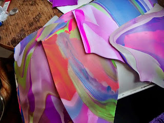
Aren't they beautiful? And I'm thrilled that they're a little brighter than the others. However the colour that really struck me when the yarn first came in was the Oasis. A beautiful combinsation of soothing sea blues and playful orange-y pinks (think fruit salad sweets - lovely) and I had to cast it on straight away.
Isn't that adorable??? Let's have a look at the actual thing because this is Pattern of the Week afterall, not just admire my beautiful colourways...

King Cole 3792. Gorgeous, gorgeous, gorgeous. It's like the first, and probably the last, time I ever knitted the pattern in the colourway suggested. I was disappointed that the size I chose didn't allowed the colours to mix on the fronts and the sleeves in the way it does on the pattern picture:


King Cole 3792. Gorgeous, gorgeous, gorgeous. It's like the first, and probably the last, time I ever knitted the pattern in the colourway suggested. I was disappointed that the size I chose didn't allowed the colours to mix on the fronts and the sleeves in the way it does on the pattern picture:

It's just a size thing. I'll survive. As an aside I also adore the little suit on the other side. I can imagine Prince George wearing something like that when he was a proper littlely can't you?
I'm trying to work out what I can tell you as a top tip today and I'm struggling. It's a really easy pattern. There's a ripple type pattern to it but it's not lacey - just basic increases and decreases. There's no shaping to mess that up at the edge or anything and once you've done the initial set up rows by reading every single row like we all do, it's very much 'set up' in a way that would be heard to mess up. Have a closer look:
That line there, right in the middle, is the beginning (or end) of a new repeat. It's where the decreases happen. They pull the bias of the material doooooooown. Now at the two third points of the picture, you'll see that the bias of the material goes up - it's the opposite and you'll not be surprised to hear that that means that's where the increases are. And then the bias moves downwards again, with decreases and so on and so on forever and ever. Like I said before, once you've set up the initial pattern, a full repeat of the stocking stitch rows and the garter stitch rows, those lines of increase and decrease are set up. You can use stitch markers if you want, one popped in between each of the decrease lines should be sufficient, but I would urge you to give it a go by eye. It's very empowering to be able to 'read' your knitting - not just what's a knit and what's a purl, but also where the decreases are, what sort of effect the different decreases have (kfb and m1 are veeeeeeeeeery different), where your decreases lean, why the bias is happening like it is. Little cardigans like this are not only easy and cute and quick to make, they're a fantastic learning curve when you allow yourself to get lost if needs be.
Good tip ey? POWER TO THE KNITTERS!
The pattern suggests using Pricewise DK as a contrast and actually I think that's pretty spot on. It seems to be the same base as the Flash DK. You know how not all acrylic DKs are the same? Well, these are. Boom.
Good tip ey? POWER TO THE KNITTERS!
The pattern suggests using Pricewise DK as a contrast and actually I think that's pretty spot on. It seems to be the same base as the Flash DK. You know how not all acrylic DKs are the same? Well, these are. Boom.
As a tip, all of these colourways (apart from the new Spangles and the old Summer Fruit) are based on White rather than cream, so if you're after a contrast and don't know which one to go for - plump for white and you'll be right. (Poet).
Thanks for listening Knitters of Nottingham. I'm hoping Chris might feel up to taking some actual bloody photos of me this week so normal service will resume, but actually, it's nice to have a little baby thing sometimes isn't it? Ahhhhhh.
Love Eleanor. xxxxx
Love Eleanor. xxxxx


